Selecting the perfect colour scheme for your luxury kitchen goes beyond following trends. In our years of creating fitted kitchens, we’ve learned that the right colours should reflect both your personality and complement your home’s character. A thoughtfully chosen palette creates a space that you’ll love for years to come.
Understanding Colour Impact
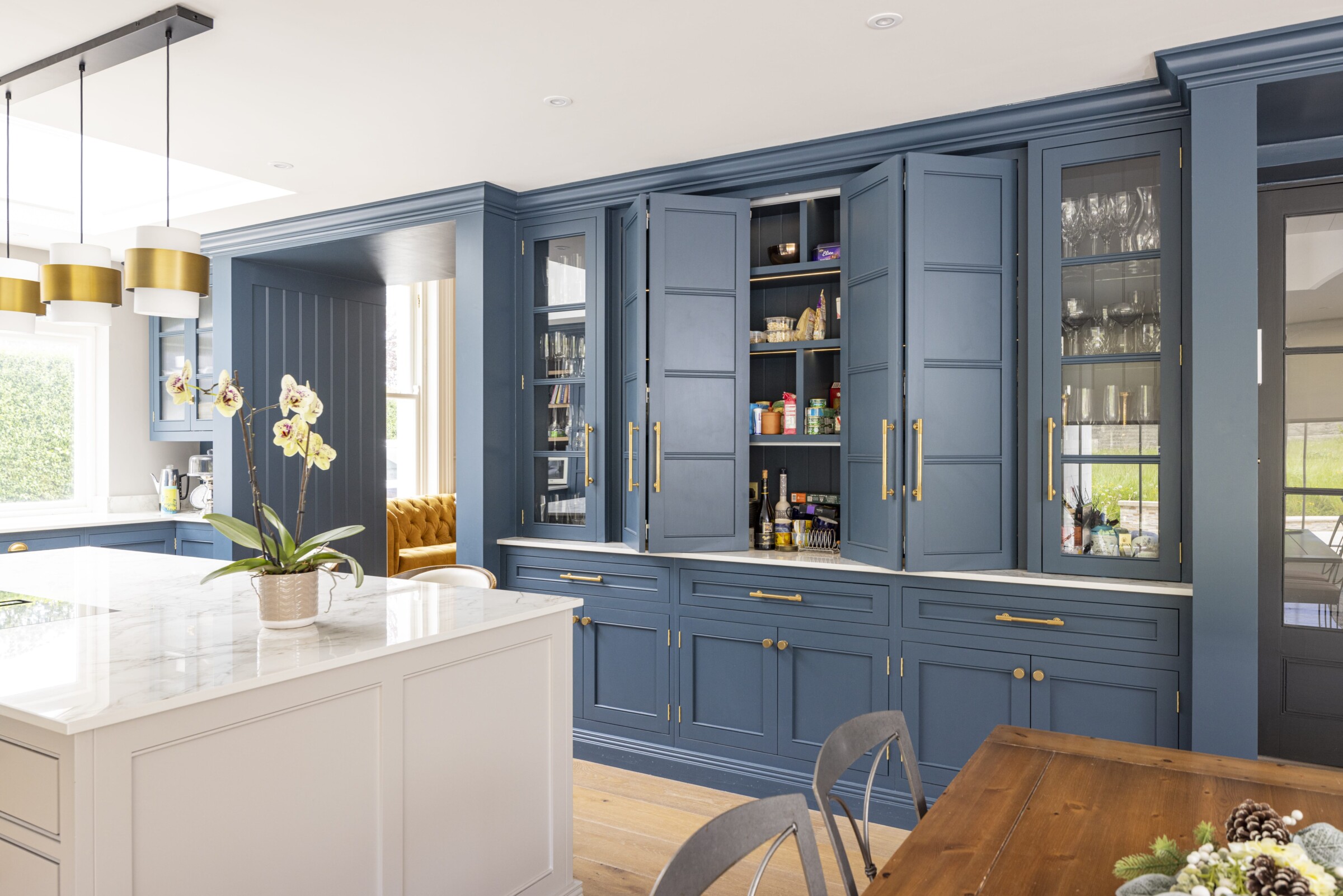
The kitchen’s role has evolved – it’s now the heart of family life and entertaining. Our Sutton Renovation showcases how colour can define different zones within the same space. Here, we used Farrow & Ball Inchyra Blue for the tall cabinetry, Wevet for the mantel and wall cabinets, and Cornforth White for the island, creating natural transitions between cooking, storage, and social areas.
Classic Neutrals with Character
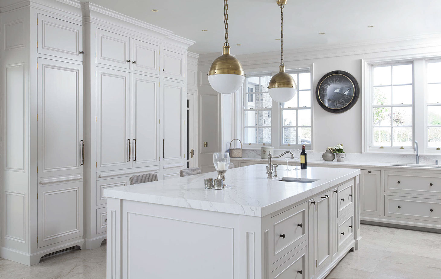
Neutral doesn’t mean boring. Take our Kildare Inframe project, where a single shade of Helen Turkington Goat’s Beard creates a serene backdrop for Calacatta marble worksurfaces. This approach proves that sophisticated neutrals can create just as much impact as bold colours when paired with luxurious materials and thoughtful design.
Making a Statement with Darker Tones
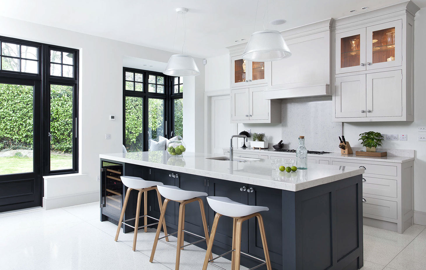
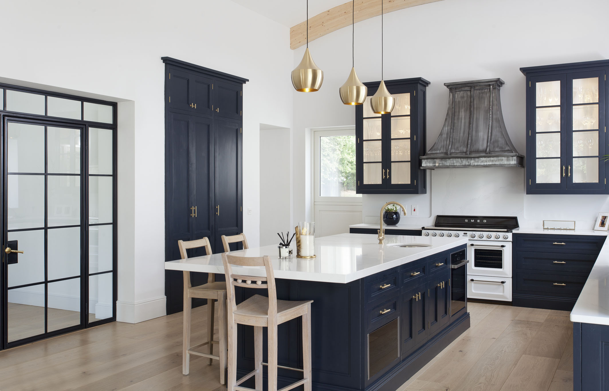
Dark colours are increasingly popular in luxury kitchens, and for good reason. Our Blackrock New Build project features Farrow & Ball Railings on the island, complementing black window frames and creating a striking focal point.
When using darker shades, we consider:
- Natural light levels throughout the day
- Room dimensions and ceiling height
- Balance with lighter elements
- Cabinet door style and how shadow plays on the surface
- Hardware finishes that will stand out against the colour
Colour Combinations That Work
Through numerous Dublin kitchen projects, we’ve refined our approach to colour combinations:
Contemporary Contrasts
Our Oak & Railings project demonstrates how to mix materials and colours successfully. The deep railing paintwork provides a sophisticated backdrop for natural oak, creating a modern yet timeless aesthetic.

Heritage Tones for Period Properties
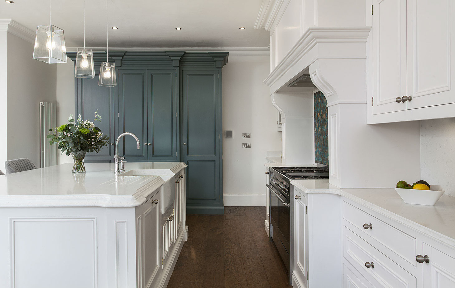
We often work with historical colours that respect the home’s character while adding modern freshness. The Greystones Renovation project uses Farrow & Ball Hague Blue and Purbeck Stone to bridge traditional and contemporary elements.
Considering Your Space
When selecting colours for your fitted kitchen, we consider several factors:
Natural Light
- North-facing rooms might benefit from warmer tones like our Little Greene Portland Stone Deep
- South-facing spaces can handle cooler tones like Farrow & Ball French Grey
- East/West-facing kitchens change character throughout the day, making neutral tones particularly effective
Architecture
- Period features often pair beautifully with heritage colours
- Modern extensions suit both bold contemporary shades and subtle neutrals
- Ceiling height can influence whether to use light or dark tones on tall cabinetry
Practical Considerations
Our experience creating luxury kitchens has taught us some practical aspects of colour selection:
- Hand-painted for the best possible finish and to allow for future colour updates
- Contrasting island colours help define zones in open-plan spaces
- Certain colours show fingerprints more than others
- Natural materials like oak and walnut add warmth to any colour scheme
The Impact of Finishing Touches on Your Kitchen Colours
Colour selection doesn’t stop at cabinetry. In our Kilkenny Renovation project, we carefully considered:
- Hardware finishes – from polished chrome to aged brass
- Worktop materials and their undertones
- Splashback colours and materials
- Lighting effects on different paint finishes
- Appliance colours and finishes
Making Your Kitchen Palette Decision
Most important is to create a colour scheme that you will love for years to come. In making your final decisions:
- Considering painting out some tester pots in your actual space
- Consider your existing furnishings and flooring
- Look at how colours work with your chosen door style
- Think about long-term satisfaction rather than short-term trends
Luxury Kitchens in Your Palette, From Shalford
Choosing colours for your luxury kitchen should feel exciting, not overwhelming. Our design team guides you through the process, helping you create a space that feels uniquely yours while maintaining the timeless quality that Shalford kitchens are known for.
Visit our Naas showroom to explore colour combinations in person and see how different finishes work together in a luxury-fitted kitchen setting.